JHVEPhoto
In late July, Merck experienced a sharp, 15% decline following what appeared to be a five month distribution top. Many investors now believe Merck is going lower, but we don’t, at least not yet. The technical and sentiment indicators we follow suggest Merck is ready for a year-end rally that will carry it back to previous highs. If it does it will provide current holders a second opportunity to reassess the situation and either sell or hold for higher prices. It would also provide new buyers with a possible gain of 15% over four months.
Long-Term Trend Channels For Merck
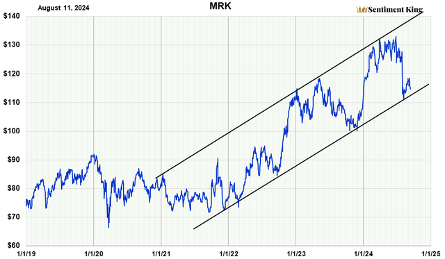
The chart below shows Merck since 2019, and we’ve drawn two trend channels. The lower channel represents support for Merck over the intermediate to long-term; the upper channel represents resistance.
It’s clear that Merck’s bullish price move since January 2022 has carried it forward, contacting the upper resistance line three times and the lower support line four times. The fourth time was the fast July sell off.
We believe this lower line will again provide support for another move up, at least to $133. At that time, a new assessment would be made on whether to sell or hold for higher prices.
Standard Straight Trendline Price Channel As Explained In “Technical Analysis of Price Trends” by Edwards and McGee (The Sentiment King)
“Too Many” Investors Think Merck Is Headed Lower
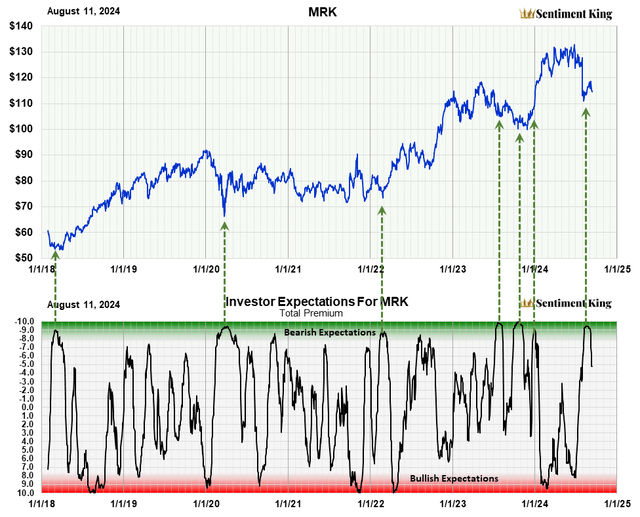
It’s a truism that you want to avoid a stock when “too many” investors believe it’s headed higher, and buy the stock when “too many” think prices are headed lower. The chart below shows the technical tool we use to help investors do this. Red zone readings are when “too many” investors expect higher prices, and the Green Zone when “too many” expect lower prices.
Measuring investor emotion and expectations is the great, unexplored area of stock analysis. When “too many” investors have the same expectation, the opposite usually happens. The term “indicators of investor expectations” was coined by Marty Zweig in the 1970s. To discover what investors expect, he compared their buying of “put” and “call” option contracts. At the Sentiment King, we’ve gone further. We compare how much “money” is going into put options, expecting the price to decline, versus how much is going into call options, expecting a rise. This is not a short-term indicator. Ratios are calculated over 20 days to obtain long-term expectations. The Green Zone represents extreme bearish expectations, while the Red Zone represents extreme bullish expectations.
In the last 6 1/2 years, there’s been nine Green Zone readings, which is an average of one and a half signals a year. This makes it an intermediate to long-term indicator. The recent Green Zone reading shows “too many” investors expect lower prices for Merck. This is a positive signal for higher prices.
Bollinger Bands Show Merck Has Intermediate Support at $110
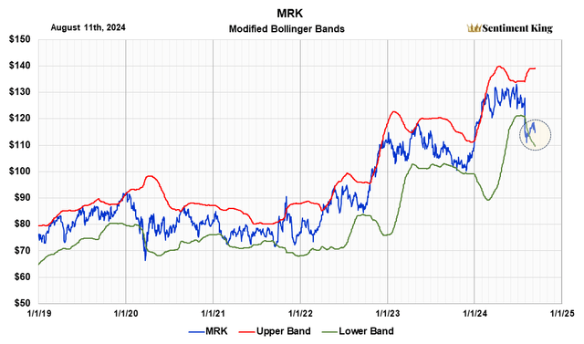
Another way to look at price excesses in Merck stock is by using Bollinger bands. They show how far prices have advanced beyond the norm.
This next chart shows that the price decline in July carried it temporarily below the lower Bollinger band (green) before rising just above it. This lower band is now approximately where the uptrend line comes in. This combination provides strong support at $110.
Bollinger Bands are a popular technical tool used by traders and investors to assess if a stock is overpriced or undervalued. They were created in the 1980s by financial expert John Bollinger. A simple moving average is calculated that represents the trend of interest; in our case, we use a 100-day average. Then the standard deviation over the same period is calculated, and upper and lower bands are placed above and below this moving average that represent a specific number of standard deviations. In our case, we use two. Because the distance of the bands is based on standard deviation over 100 days, they expand and contract with price volatility. This means that, in volatile markets, support and resistance occurs at higher or lower levels than in less volatile markets.
The circle on the left shows this. We can’t forecast whether prices will advance to previous highs from here, or return to $110 before advancing back to previous highs. Because of this, we recommend that new investors invest half the money they intend to allocate to Merck now, and the other half if the price returns to $110. If not, invest the other half if Merck breaks above $120.
Merck Relative Strength Is Positive For The Long-Term
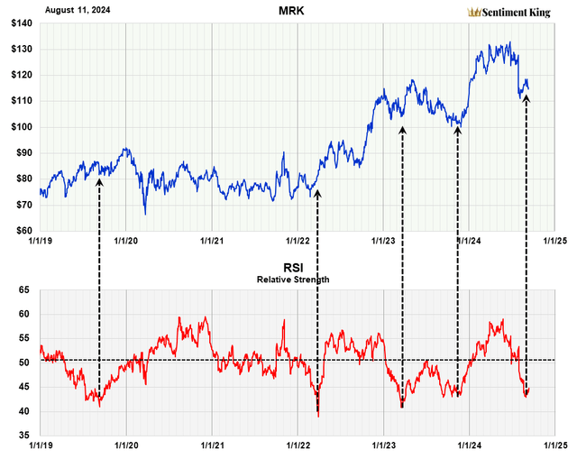
This last chart shows the long-term RSI index for Merck. We calculate our RSI to show relative strength over the long-term; this is not a short-term view.
The chart shows that the recent sell-off in Merck has moved the RSI down below 45, which is intermediate term oversold levels. We’ve indicated with black arrows the periods in the past when there were equivalent readings. Each indicated Merck was oversold, and a significant rally followed.
The relative strength index (RSI) was developed by J. Welles Wilder Jr. and introduced in his 1978 book, “New Concepts in Technical Trading Systems.” It is probably the most popular momentum indicator used in technical analysis. The RSI measures the speed and magnitude of recent price changes in a stock to evaluate if it’s been oversold or overbought. It has adjustable parameters that allow you to measure these conditions for either the short or long term. We’ve adjusted the RSI parameter in our graph to show the long-term picture.
Conclusion
It’s our opinion, investors in Merck should expect a rally back to a high of $133 by the end of the year, which would be a gain of 15% over four months. Current investors should hold their shares. New investors should buy with half the money allocated for Merck, and the other half if Merck retreats to $110, or continues up and breaks through $120. If the price target of 133 is reached, we will reassess whether it’s forming a double top or going higher.


